
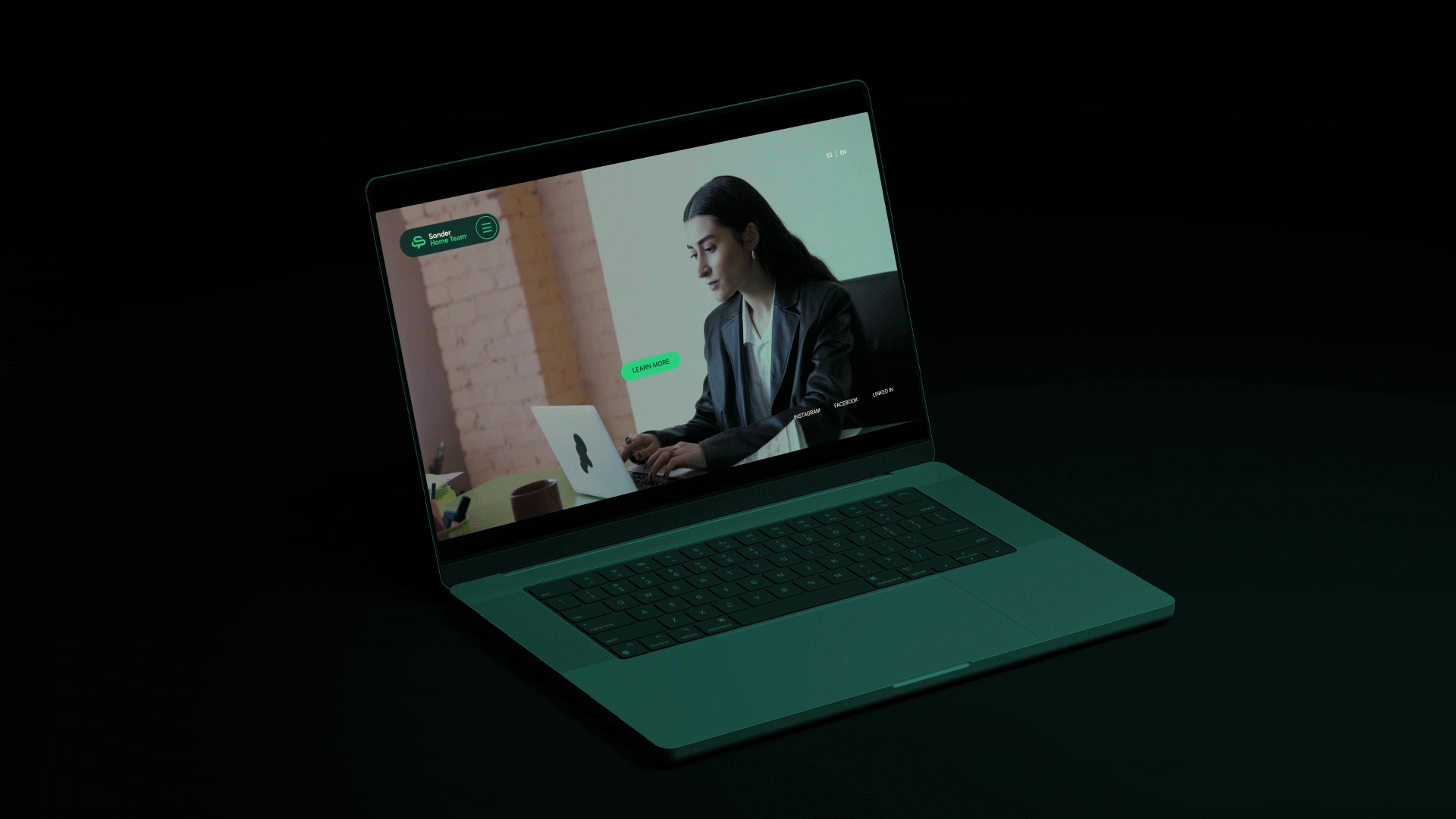
SONDER HOME TEAM
We developed the brand identity for Sonder, a people-first organization with a strong focus on culture, internal alignment, and long-term social impact.
The objective was to create a corporate brand that speaks directly to its employees while remaining scalable across multiple business verticals, including real estate, maintenance, marketing, and community initiatives. Rather than building a traditional external-facing identity, the challenge was to design a brand system rooted in purpose, one that could unify teams, communicate values, and grow alongside the organization.
We introduced the concept of the “Be Tree” — a central brand idea inspired by the structure, growth, and interconnectedness of a tree. This metaphor became the foundation for the entire identity system, informing the logo, color palette, and visual language. Each element was designed to reflect strength, development, and collective growth.
The identity was built as a flexible and scalable system, capable of extending into sub-brands such as Home Team, the real estate division of Sonder, while maintaining consistency across future business units and initiatives.
The result is a cohesive corporate brand that aligns culture, structure, and communication — designed not only to represent the company, but to be lived internally.
VISUAL IDENTITY+ BRAND STRATEGY
Results
- Delivered a purpose-driven corporate brand identity centered on company culture and employee engagement
- Created a scalable brand system adaptable across multiple business verticals
- Developed the “Be Tree” concept as a unifying narrative and visual framework
- Strengthened internal brand alignment and sense of belonging among teams
- Positioned Sonder as a people-first organization with a clear and expandable brand architecture
Sonder now operates with a brand that grows with its people — structured, connected, and built to evolve across every branch of the organization.


NEXT PROJECTS

9 HERMANOS

PINGÛINO
LEAVESAFE