

RENEWELL
El Fuego collaborated with Eightfootthinking to develop the brand identity for Renewell, a third-party distributor of pharmaceutical packaging serving major global pharma companies.
Operating in a highly standardized and visually conservative industry, Renewell needed a brand that would differentiate them without compromising credibility. The objective was to create a bold, personality-driven identity that could stand out in the sterile world of pharma packaging while maintaining trust and professionalism.
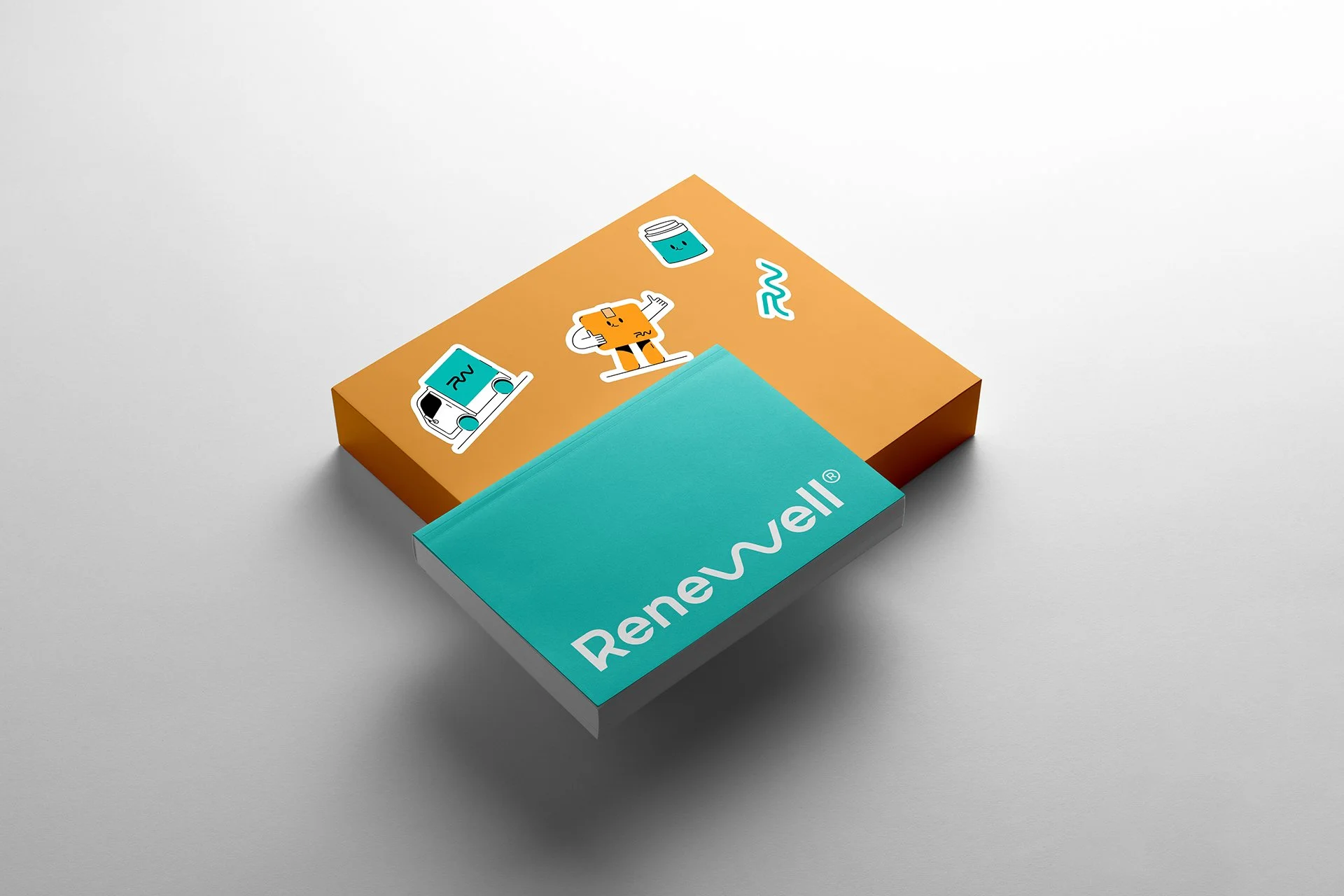
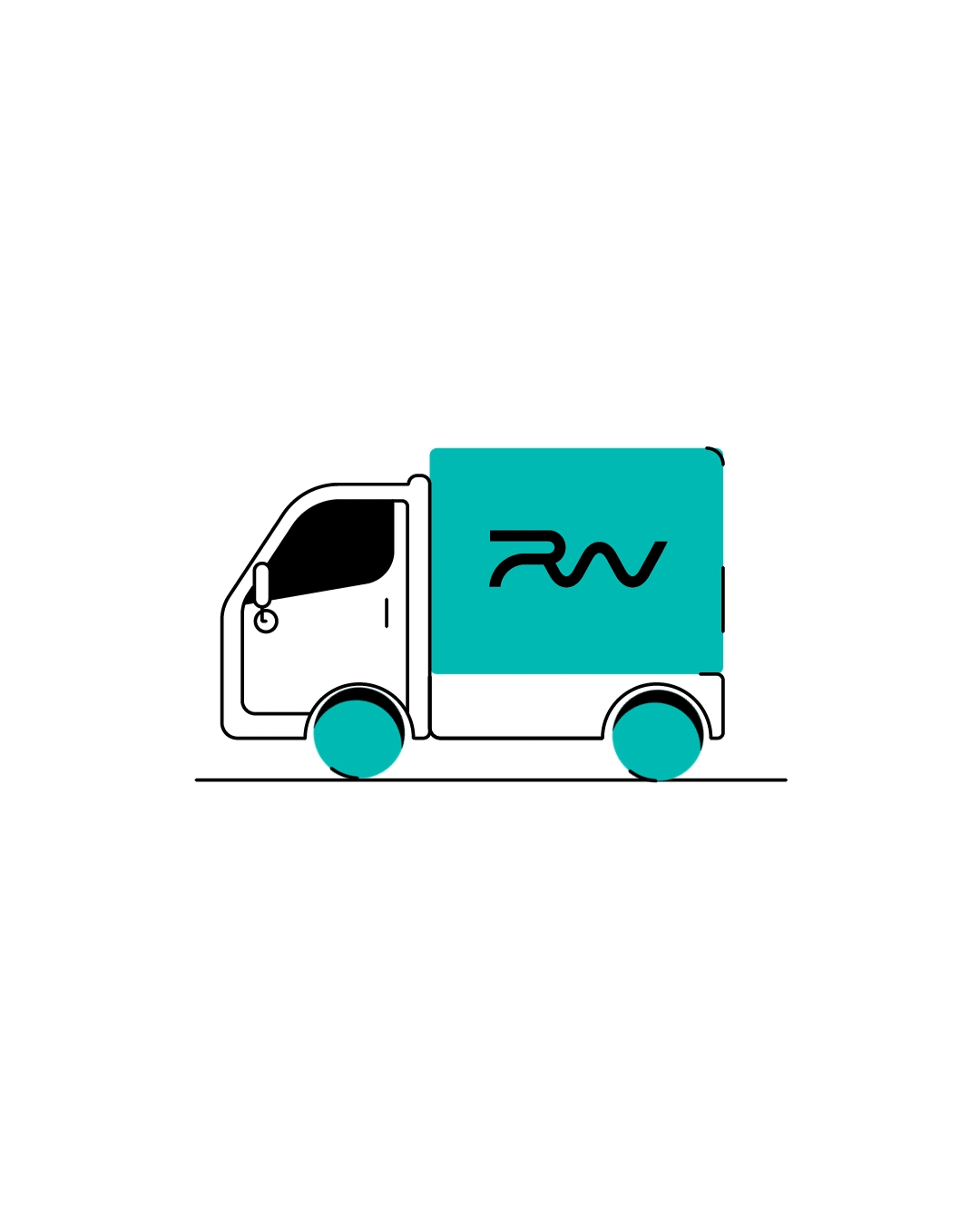
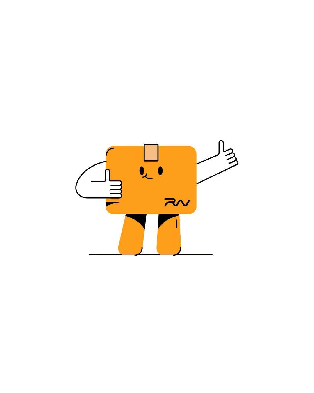
We built the visual system around a distinctive and flexible “W” monogram — a strong graphic asset designed to function as both logo and dynamic brand device. The identity was further enriched by transforming product catalog illustrations into expressive visual elements, injecting energy and memorability into the brand without losing industry relevance.
The result is a confident, witty, and strategically differentiated brand system that elevates Renewell beyond transactional distribution into a recognizable and character-driven player in the pharmaceutical supply chain.
NAMING+BRAND STRATEGY
Results
- Established a distinctive visual identity within a highly conservative industry
- Increased brand memorability and differentiation among pharma competitors
- Developed a flexible “W” graphic system adaptable across packaging, digital, and corporate materials
- Elevated product catalog visuals into strategic brand assets
- Positioned Renewell as a confident, modern partner within the pharmaceutical ecosystem
Renewell now communicates with clarity, personality, and presence, proving that even in highly regulated industries, branding can be bold, strategic, and effective.


NEXT PROJECTS

PINGÜINO

9 HERMANOS
LEAVESAFE