
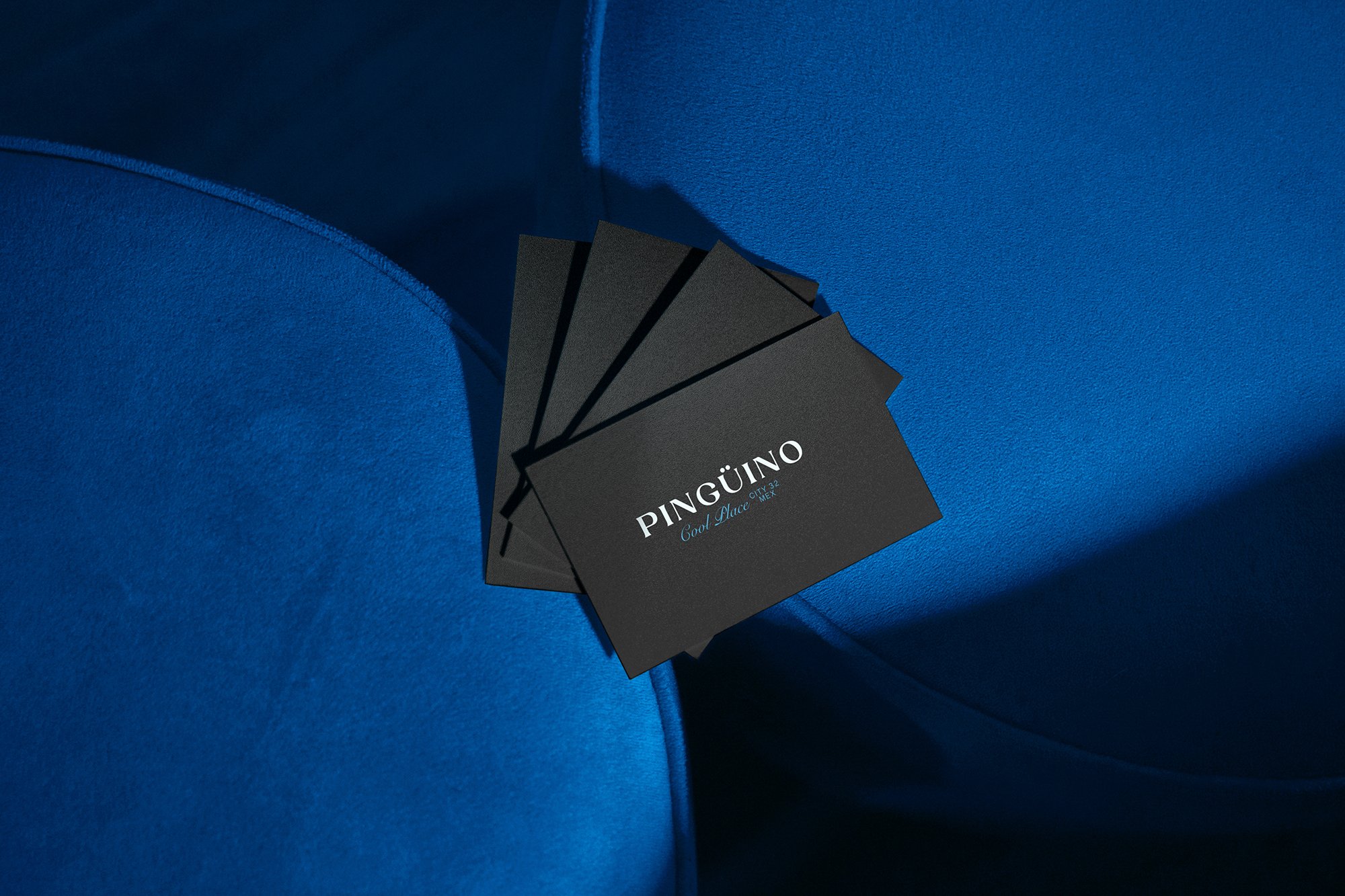
PINGÜINO
Pingüino is a bar concept in Mérida inspired by mid-20th-century Venezuelan bars. Spaces defined by music, atmosphere, and effortless social connection.
We developed the brand identity to capture that spirit: a place where time slows down, music sets the tone, and the environment becomes part of the experience. In a city defined by heat, Pingüino positions itself as a refreshing contrast — cool, relaxed, and inviting.
The goal was to build a brand that feels as effortless as the experience it offers.
Insights
Bars are often designed around intensity: loud visuals, high energy, and constant stimulation.
But Pingüino plays a different role. It’s not about escalation.
It’s about ease.
Inspired by classic Venezuelan bar culture and easy listening environments, the experience is rooted in simplicity, familiarity, and comfort, a space where people gather without pressure.
In a place like Mérida, this becomes even more relevant:
The brand needed to feel fresh, light, and emotionally accessible.
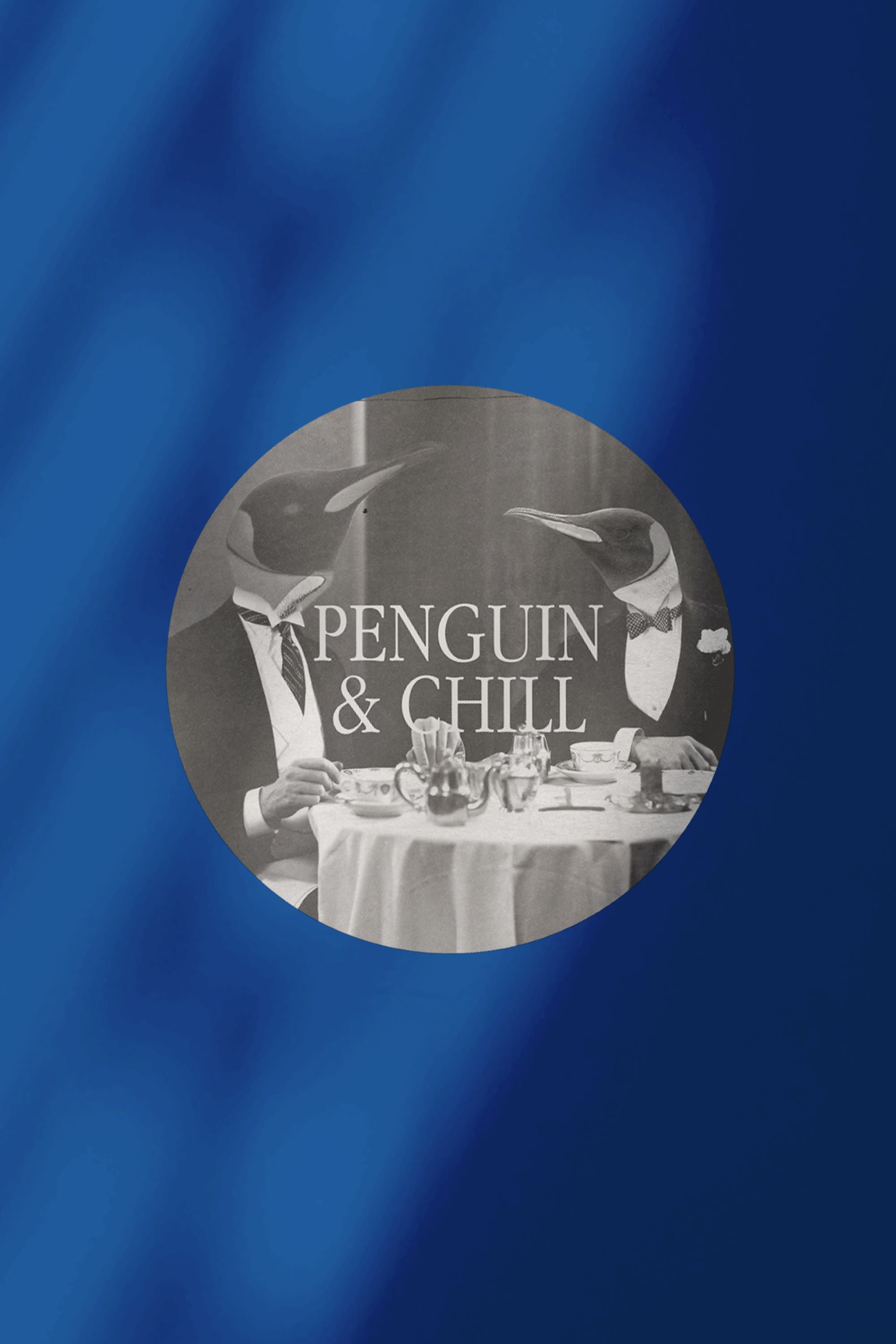
IT’S HOT TO BE COOL, WELCOME TO PINGÜINO.
VISUAL IDENTITY
Problem Solving
We built Pingüino around a central idea:
A cool escape.
The identity translates this concept into a simple, memorable system:
- Icon: A penguin — universally associated with cold, contrast, and character — acting as both symbol and personality
- Conceptual Contrast: Cold vs. heat, calm vs. noise, simplicity vs. excess
- Visual Language: Clean, minimal, and approachable — designed to feel effortless and timeless
- Tone of Voice: Relaxed, friendly, and unpretentious — aligned with the easy listening atmosphere
Rather than overdesigning, we focused on restraint — allowing the concept, environment, and experience to carry the brand.
The result is a system that feels natural, not imposed.


NEXT PROJECTS

AZTRO
PATOLA

DANON