

INSTRUMENTAL
When two leading agencies from different countries merge, the challenge goes far beyond creating a logo. The new brand has to unify cultures, teams, services, markets, and visions into a single identity that feels natural from day one.
That was the challenge behind Instrumental, an international agency born from the fusion of two major HubSpot partners from México and the United States.
At El Fuego Brand Studio, we were brought in to develop the visual identity for a company that needed to feel global, human, scalable, and entirely new.
The Challenge
The client already had the name: INSTRUMENTAL. Our role was to create a brand identity capable of representing the merger of two established companies without favoring either side, working seamlessly across international markets, feeling professional without becoming cold or corporate, aligning with the modern SaaS and HubSpot ecosystem, avoiding visual references to pre-existing brands, and creating a culture-first identity that employees could adopt naturally. This wasn’t a rebrand; it was the creation of a completely new organization with its own personality, voice, and visual language.
The Strategy
Before designing, we focused on understanding the emotional space the new company needed to occupy. The merger brought together: different cultures, different markets, different design sensibilities, and different operational structures. Instead of emphasizing the “fusion” visually, we decided to focus on the outcome of collaboration itself.
The concept became: Different talents working together as one coordinated system. Rather than creating a brand that looked overtly “tech,” we approached it from a more human perspective; a company powered by people, enabled by systems.
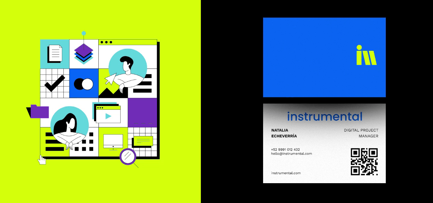
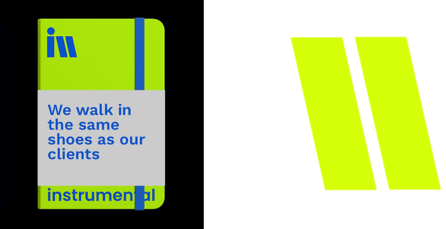
Logo
The logo was designed to feel clean, scalable, contemporary, and globally adaptable. Instead of relying on trends common in the HubSpot ecosystem, we developed a neutral but distinctive mark that could grow with the company over time. The icon was created as a metaphor of reliability and strength.
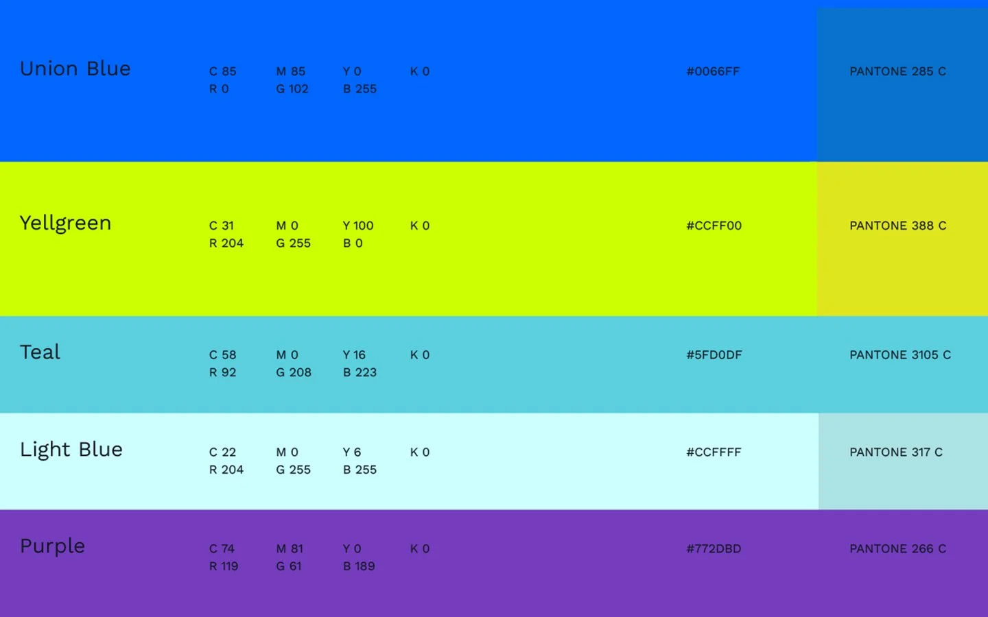
Color System
Color became one of the most important tools in the identity. We introduced a vibrant and energetic palette that reflected: collaboration, creativity, diversity, and momentum. The result balanced enterprise credibility with startup energy.
One of the most important decisions in the process was intentionally avoiding visual references to either of the founding companies.
This allowed INSTRUMENTAL to establish its own identity immediately, unify teams under a shared vision, and position itself as a new global organization rather than a partnership between two existing brands. That separation was critical for long-term scalability.
Today, Instrumental Group operates as an international HubSpot Elite Partner serving enterprise-level clients across North and Latin America.
The identity system successfully created a recognizable global brand, a cohesive internal culture, and a flexible visual language capable of evolving alongside the company.
What started as the fusion of two agencies became a completely new organization with its own voice, energy, and presence.
BRANDING


NEXT PROJECTS

