
AiKU SUPERFOODS
Your road to great.
AIKU Superfoods brings an honest, joyful perspective to everyday wellbeing. Built around natural ingredients and the desire to make daily life better, the brand speaks to people finding their own rhythm between work, movement, rest, and everything in between.
We developed a visual and verbal identity that gives this ambition a confident, approachable expression. Bold typography, vivid colors, and a distinctly human detail in the logo come together around one central idea: the great within.
An everyday kind of greatness
For AIKU, greatness begins with the small choices we make each day. Taking a moment to focus. Making space to recharge. Building a routine that feels right.
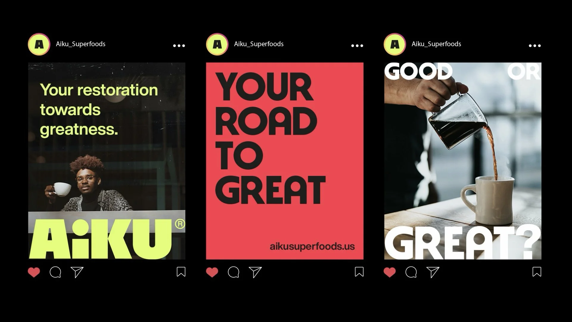
This understanding shaped the brand’s personality and creative direction. Honest, friendly, and full of optimism, AIKU makes personal progress feel accessible. “Your road to great” gives that idea a clear direction, inviting each person to define what great means for them.
A human detail at the heart of the logo
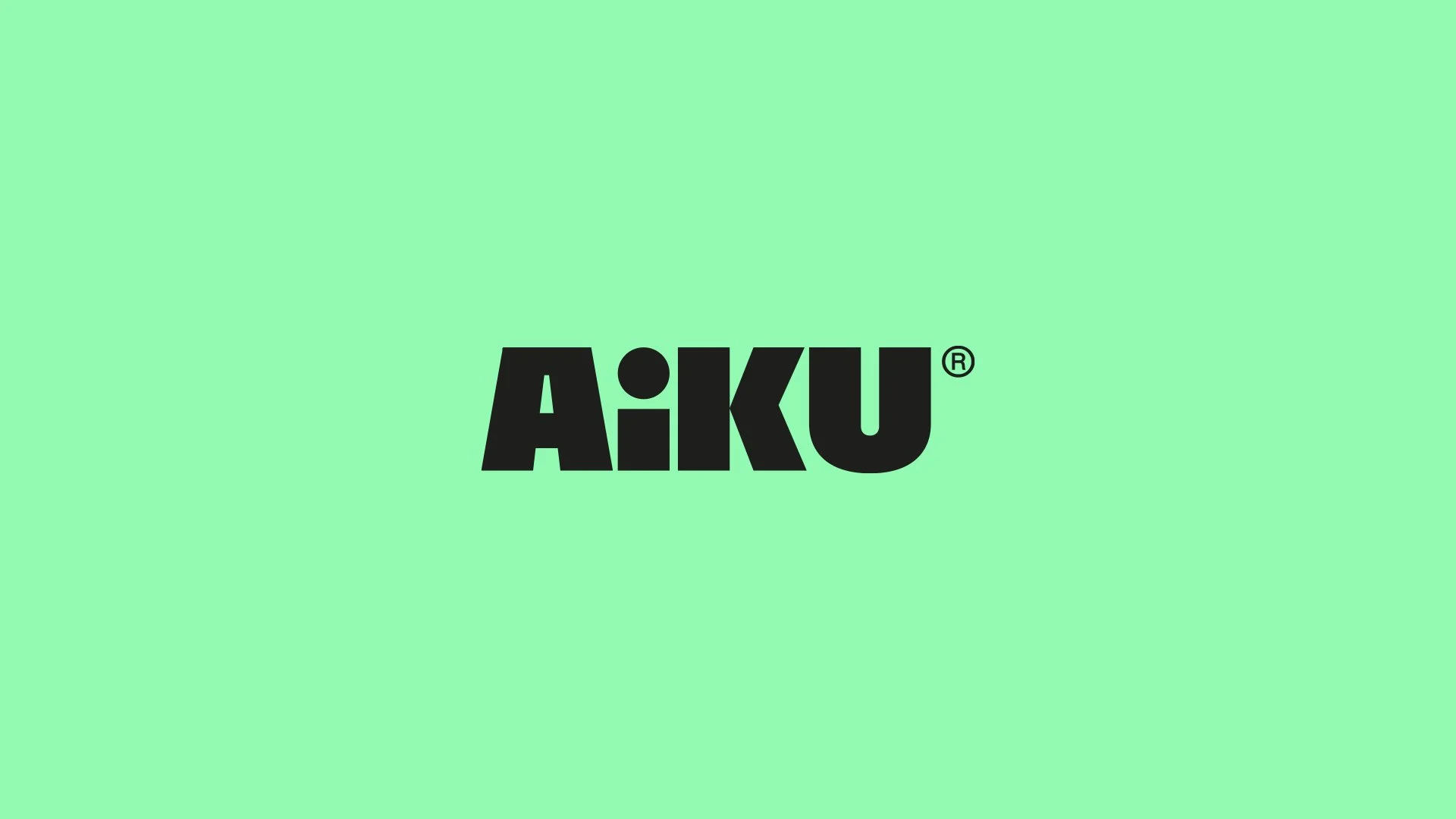
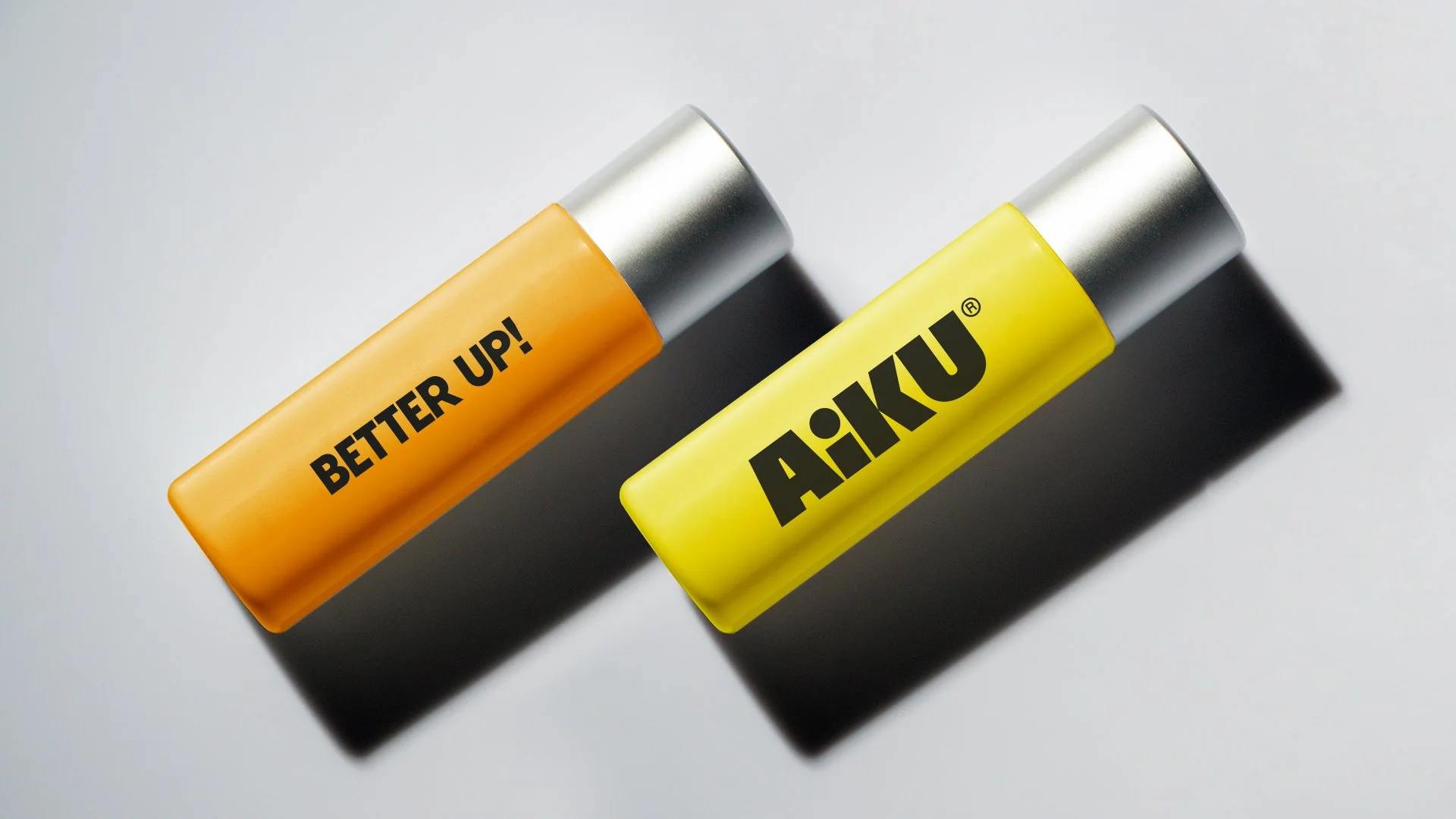
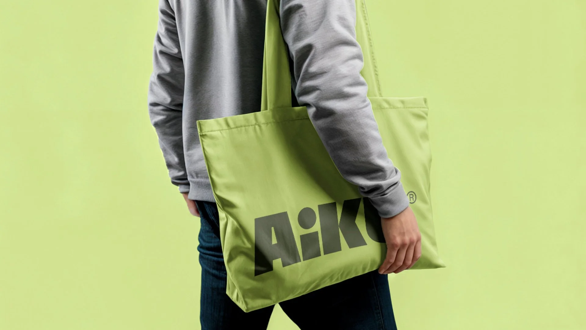
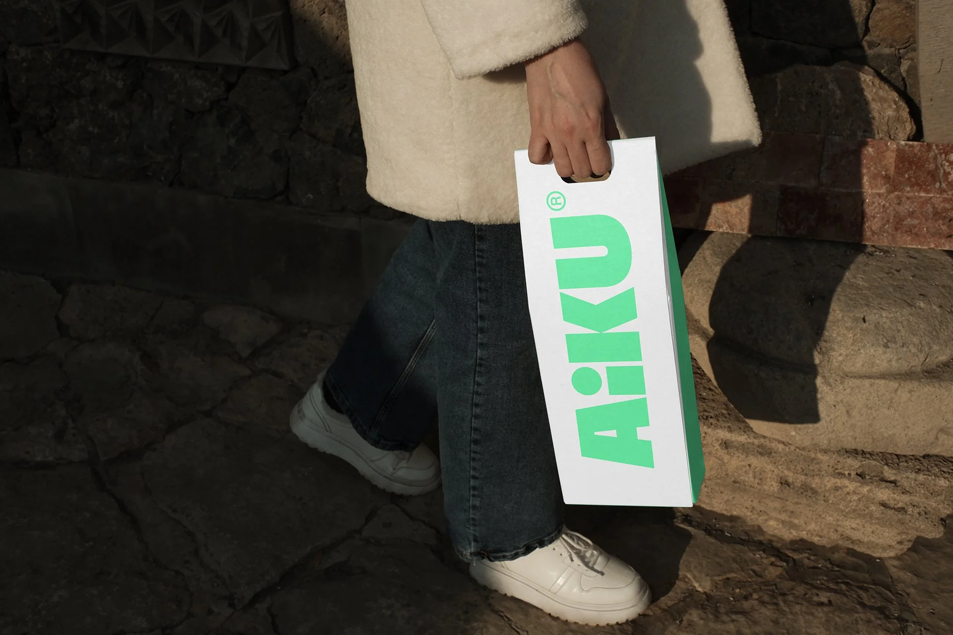
The AIKU wordmark is built from bold, modern letterforms, giving the name a strong silhouette and an immediate visual presence. Its substantial proportions establish confidence, while the combination of angular forms and rounded curves adds warmth and character.
The defining detail is the customized “I.” A circular head above a solid vertical body suggests a human figure within the name itself. This small intervention improves the wordmark’s readability and places the individual at the center of the identity, connecting the logo directly to the people the brand supports.
The “A” also works independently as a compact symbol, carrying the same visual weight into social profiles, merchandise, and smaller applications.
Color with presence and purpose
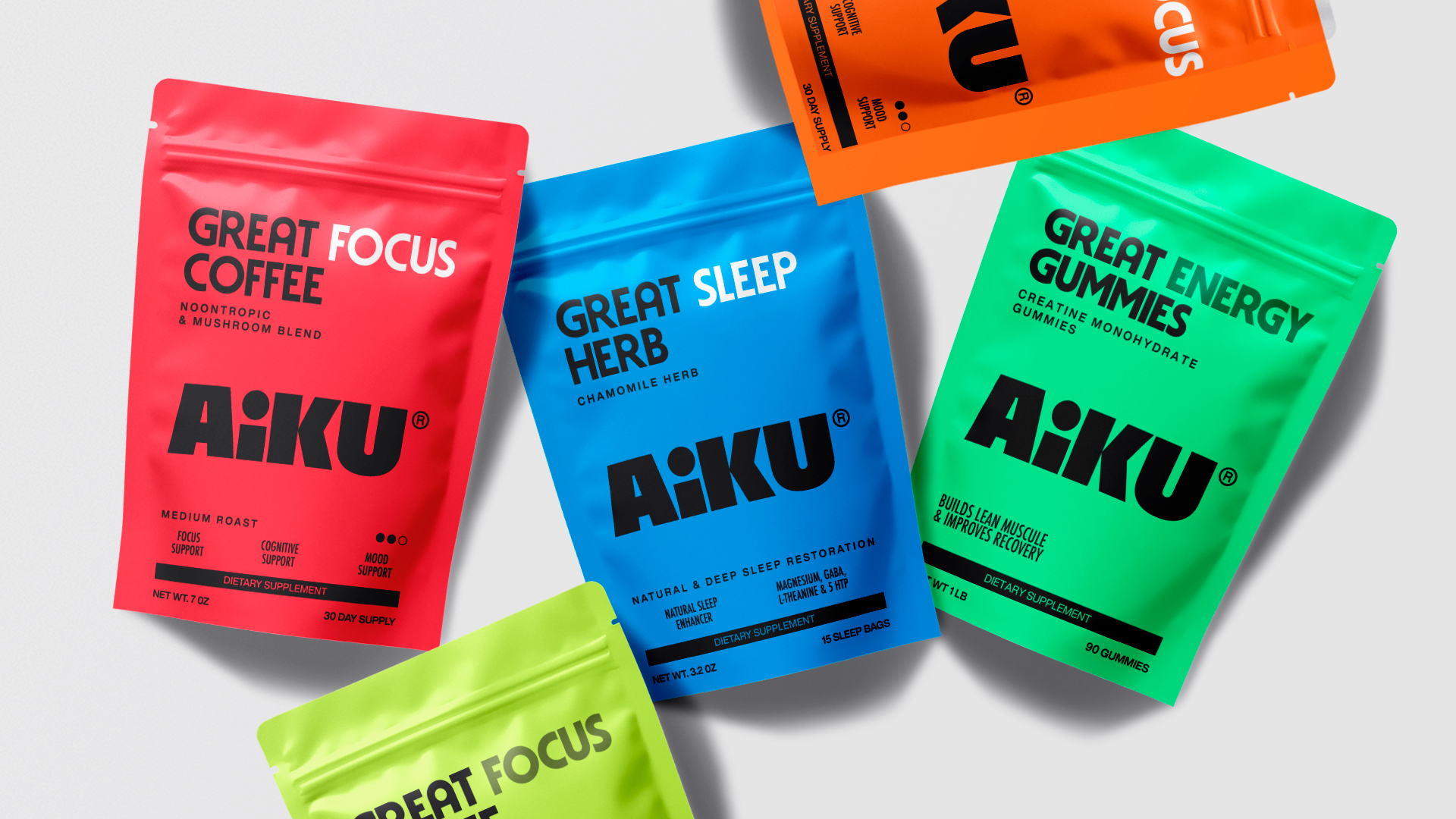
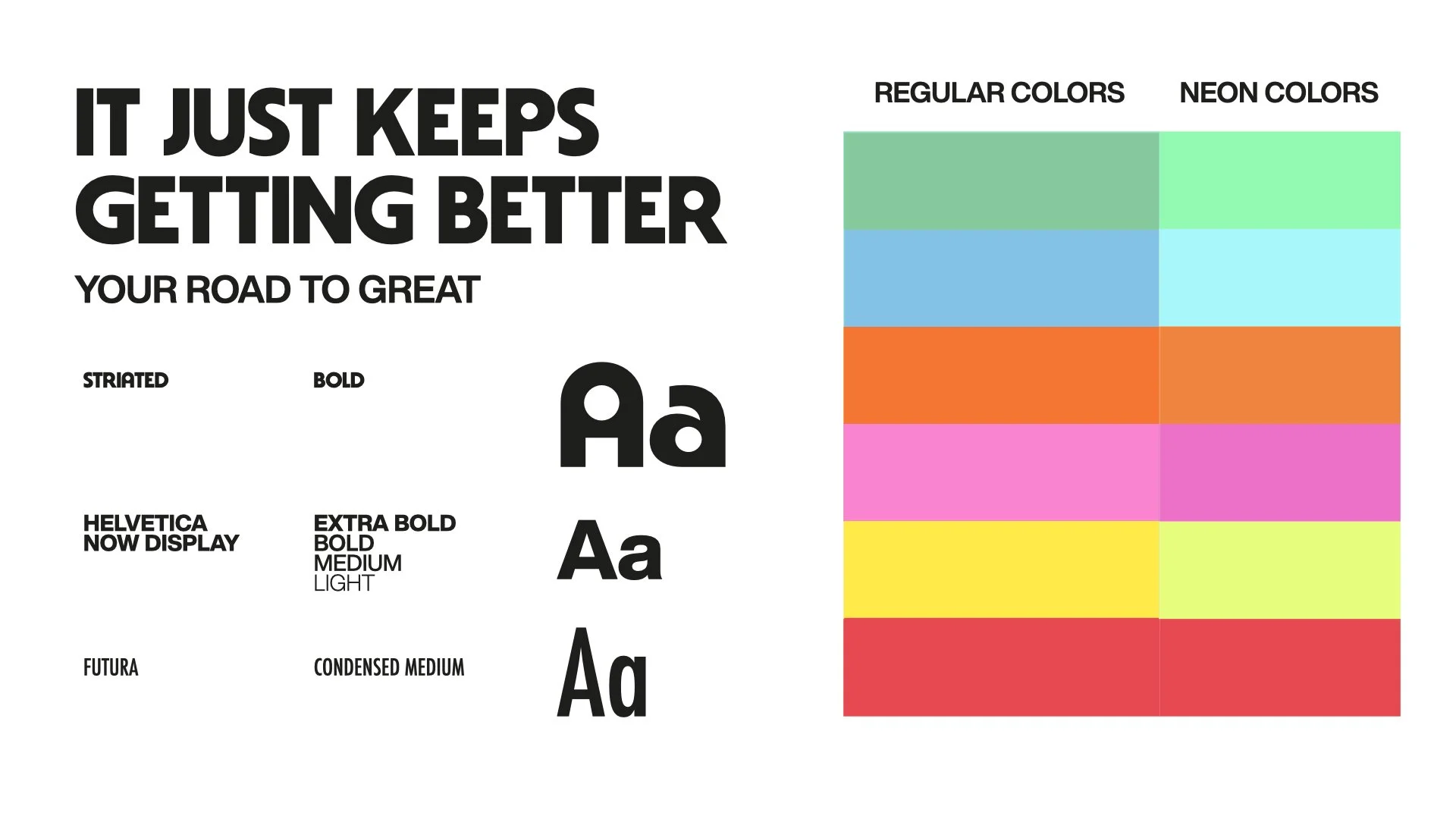
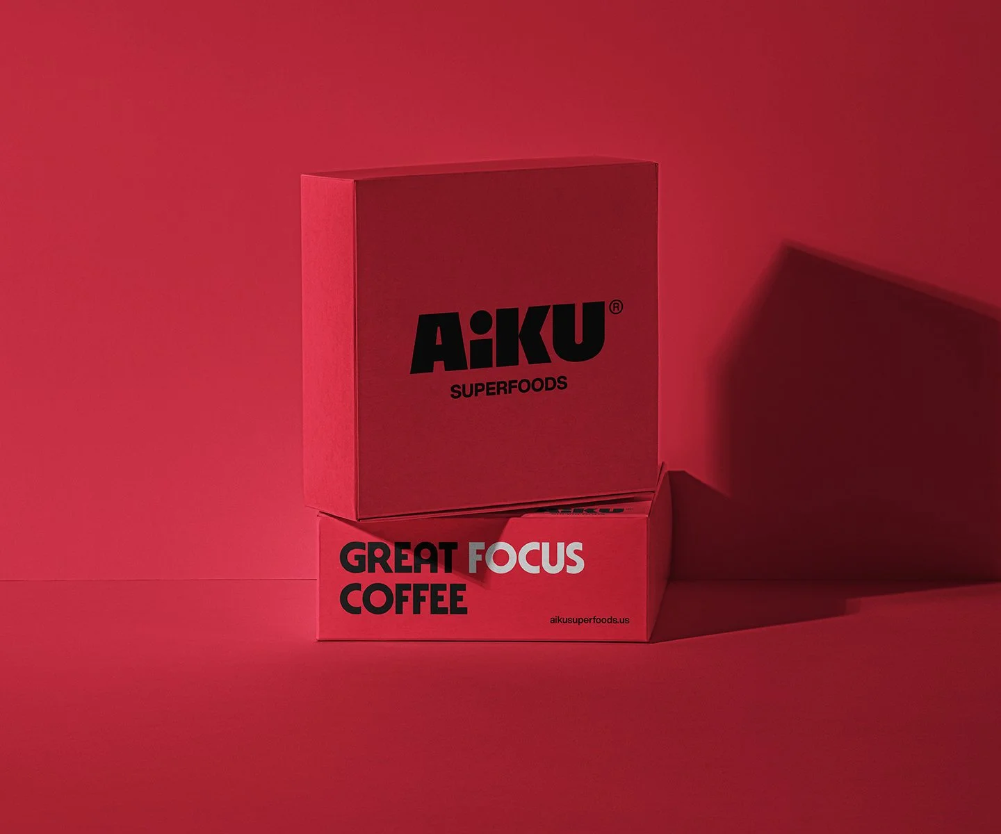
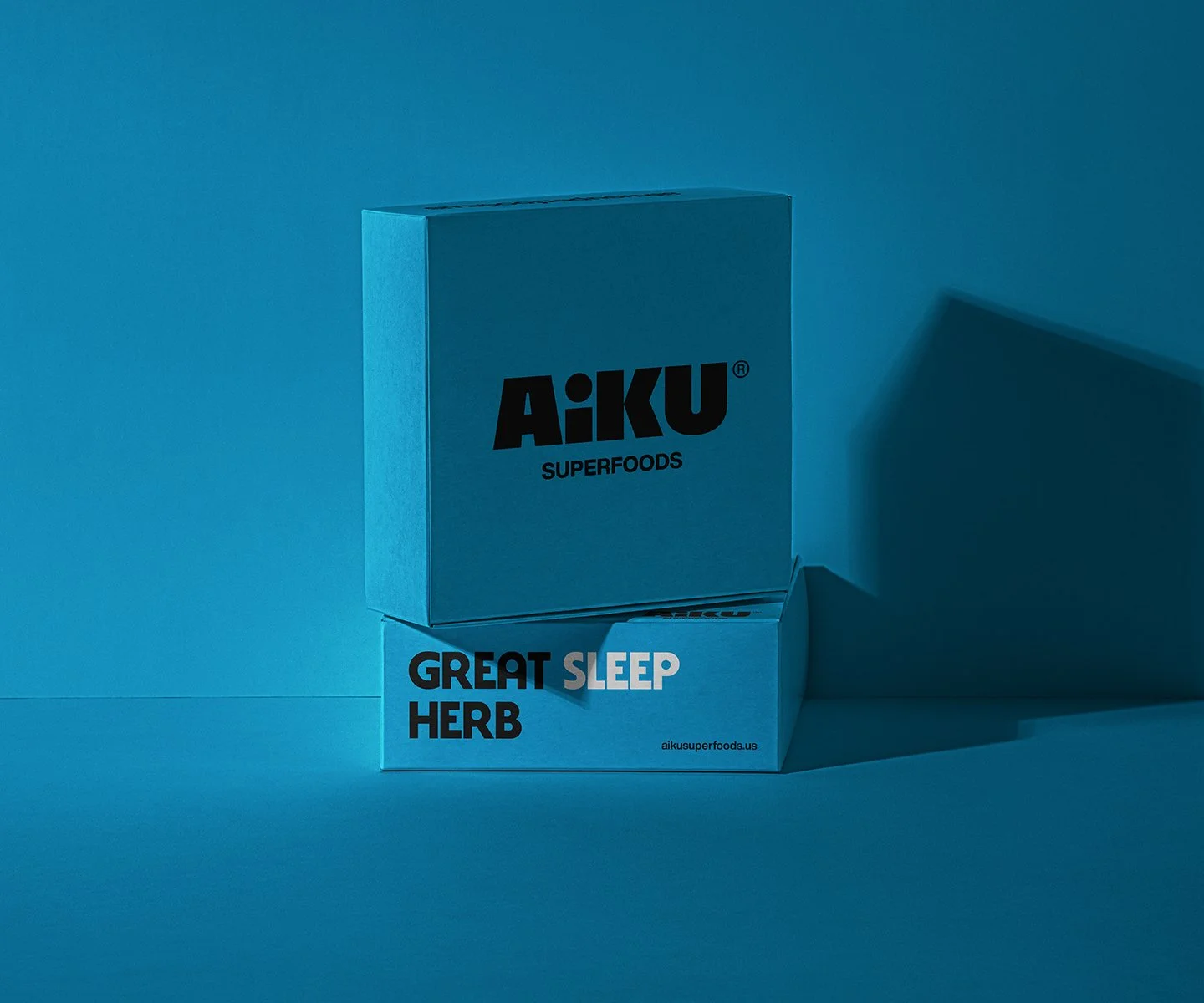
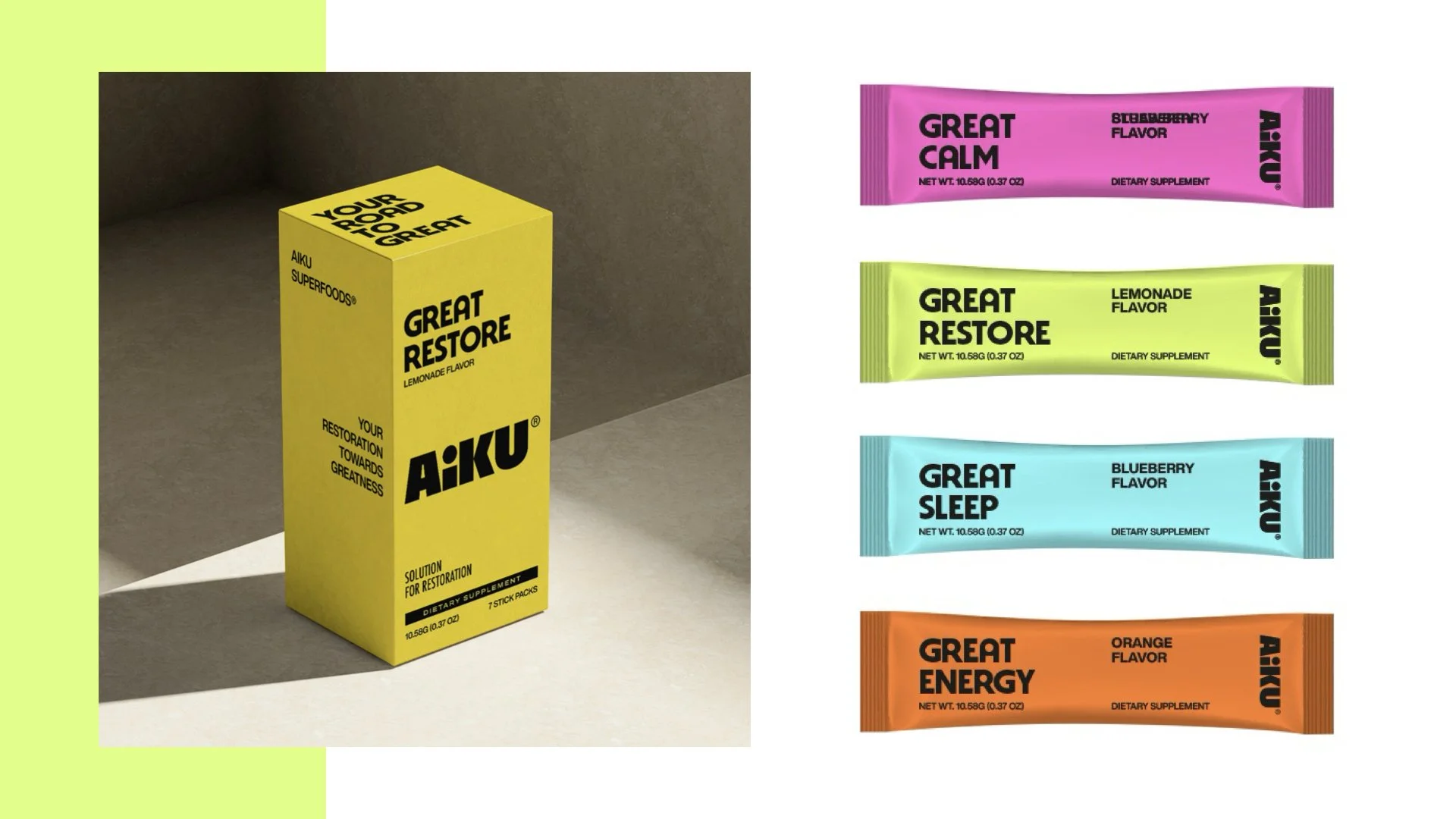
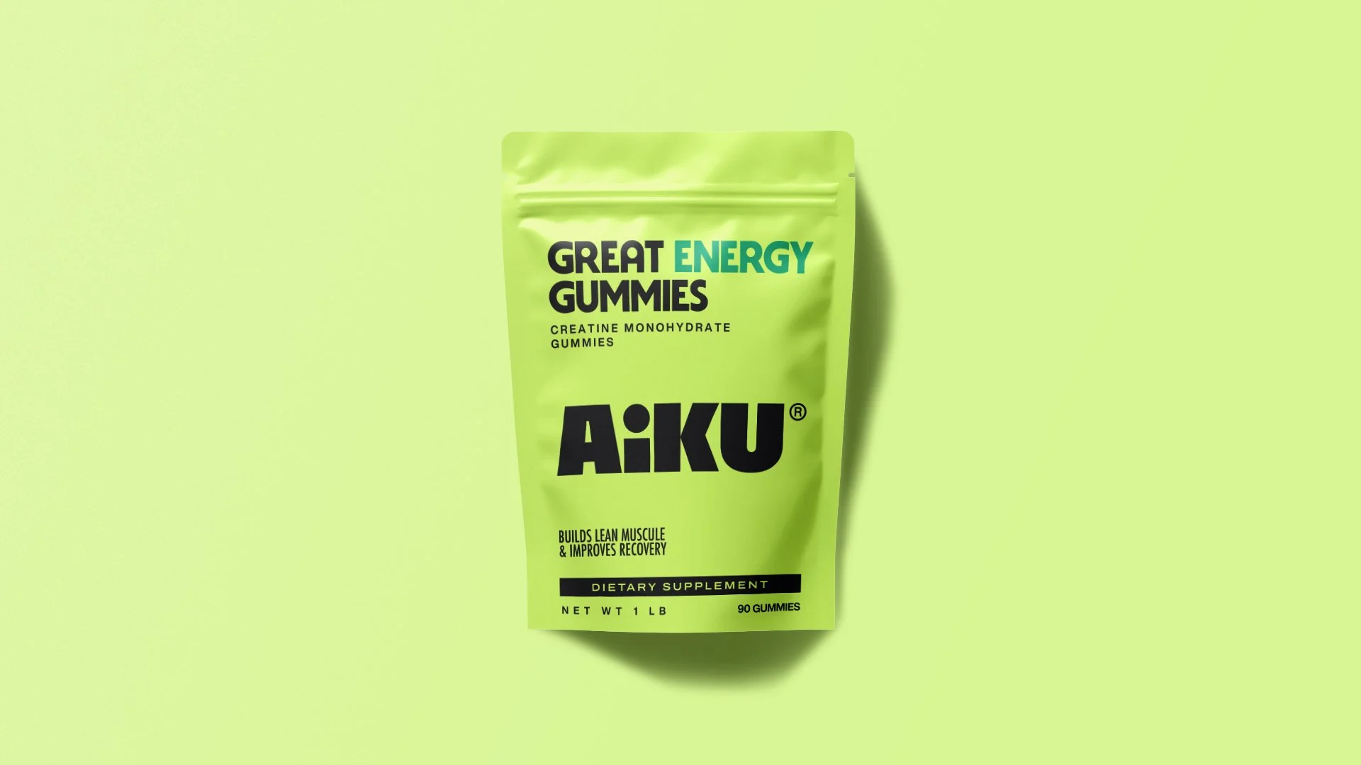
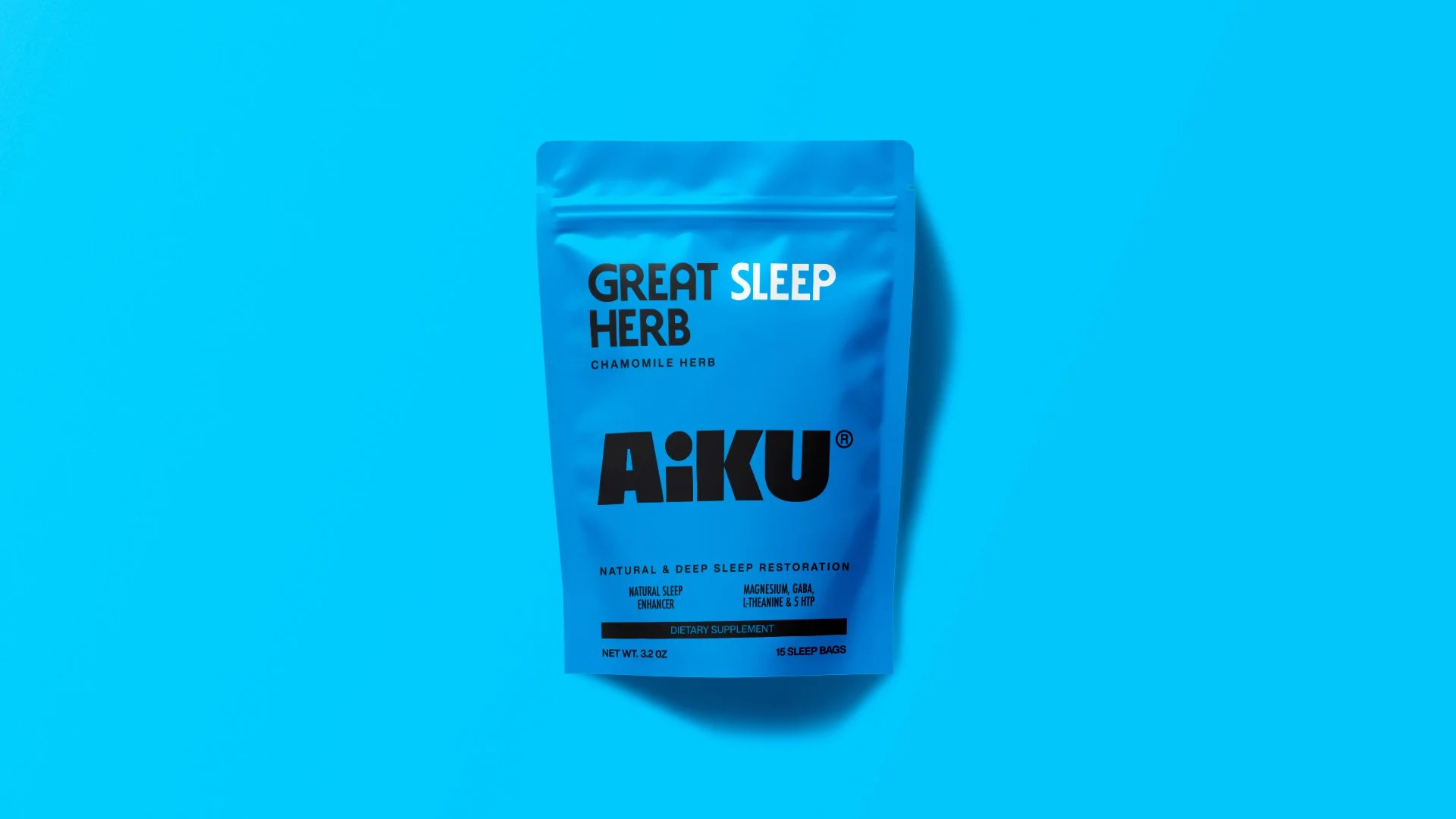
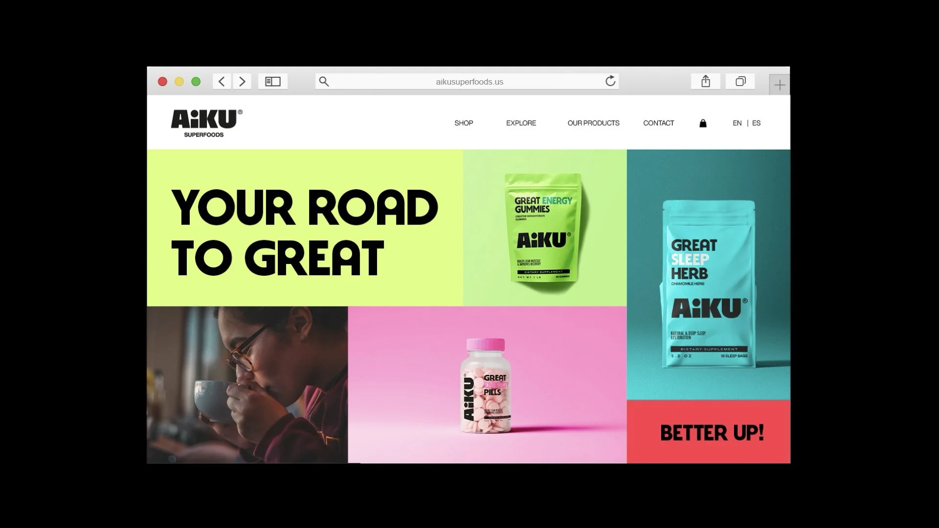
The palette gives AIKU its outgoing energy. Vivid red, bright blue, orange, pink, lime, and mint green create a broad, expressive range, supported by black, soft white, and deeper companion tones.
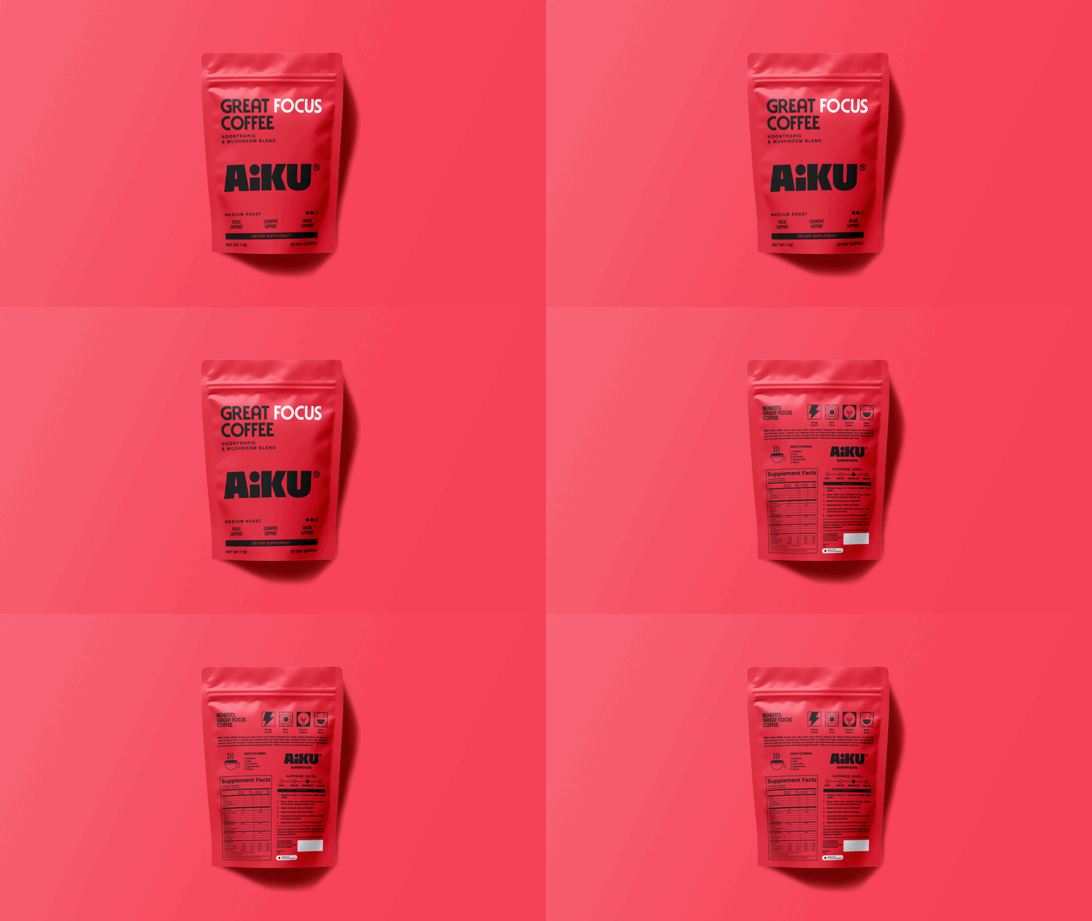
Large fields of saturated color give the packaging a strong presence and help distinguish products across the range. Consistent typography and composition keep those different expressions connected, allowing each product to have its own character within a recognizable family.
The deeper tones add contrast and dimension, while the neutral foundation gives the bolder colors room to work. Together, they express a brand that feels lively, optimistic, and easy to recognize across packaging, digital communication, and everyday objects.
One word connecting everything
“Great” became the recurring thread of AIKU’s verbal identity.
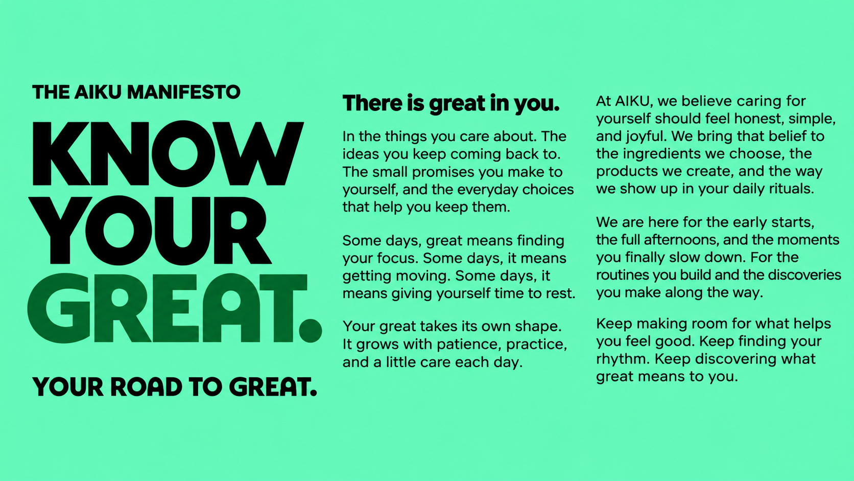
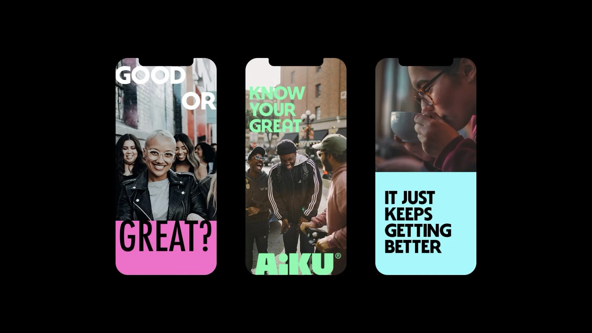
Across product names such as Great Focus, Great Sleep, and Great Energy, the word creates a consistent naming structure that connects the range to the brand’s central idea. In phrases such as “Know your great” and “Your road to great,” it becomes a personal invitation.
Its repetition also gives the identity a distinctive visual rhythm. Set in bold typography, “great” becomes a graphic element in its own right, bringing continuity to packaging, campaigns, and social content.
Through this shared language, every application contributes to the same story: everyday rituals, individual potential, and the possibility of feeling a little closer to your great.
BRAND STRATEGY
NEXT PROJECTS

PINGÜINO

9 HERMANOS
LEAVESAFE