

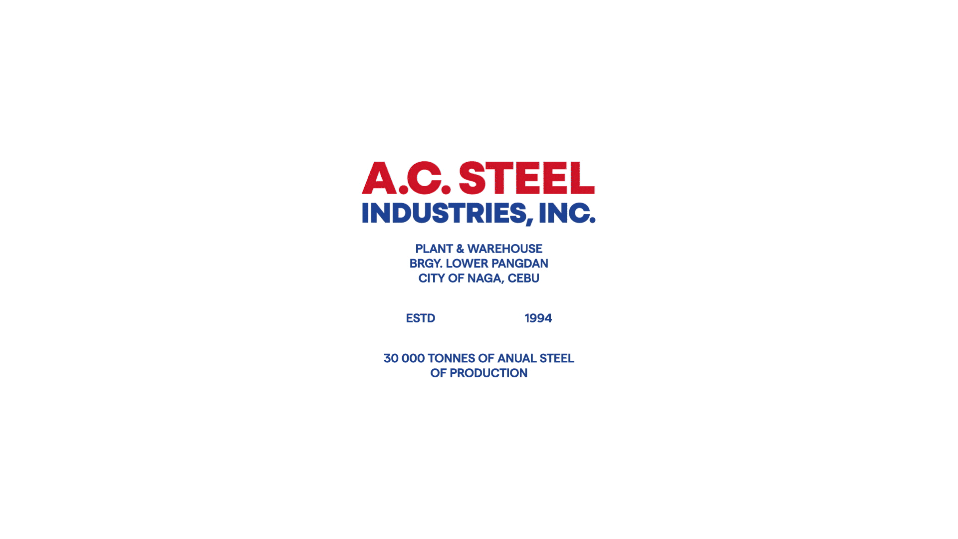
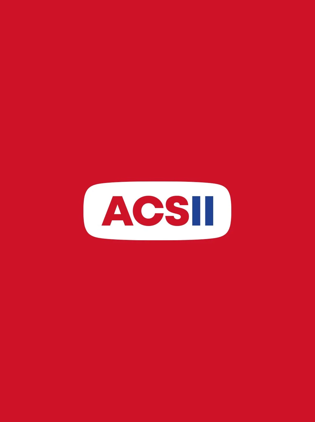
AC STEEL
Honoring Legacy. Forging the Future.
The Challenge
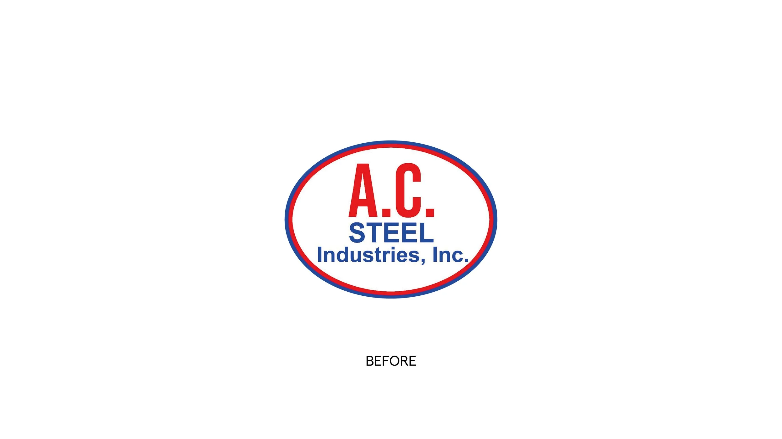
AC Steel, a long-established steel manufacturer in the Philippines, had built decades of recognition in the roofing industry. Their original logo carried familiarity and trust — but visually, it no longer reflected the scale, ambition, and professionalism of the company they had become.
The challenge was clear:
Evolve the brand to stand out in a competitive industrial market while preserving the emotional and historical equity embedded in the original mark.
This was not a rebrand.
It was a careful evolution.
The Insight
When we looked beyond the product, we found something more powerful.
AC Steel isn’t just manufacturing roofing sheets.
They are helping build homes.
They are protecting families.
They are reinforcing dreams.
Their manifesto says it best:
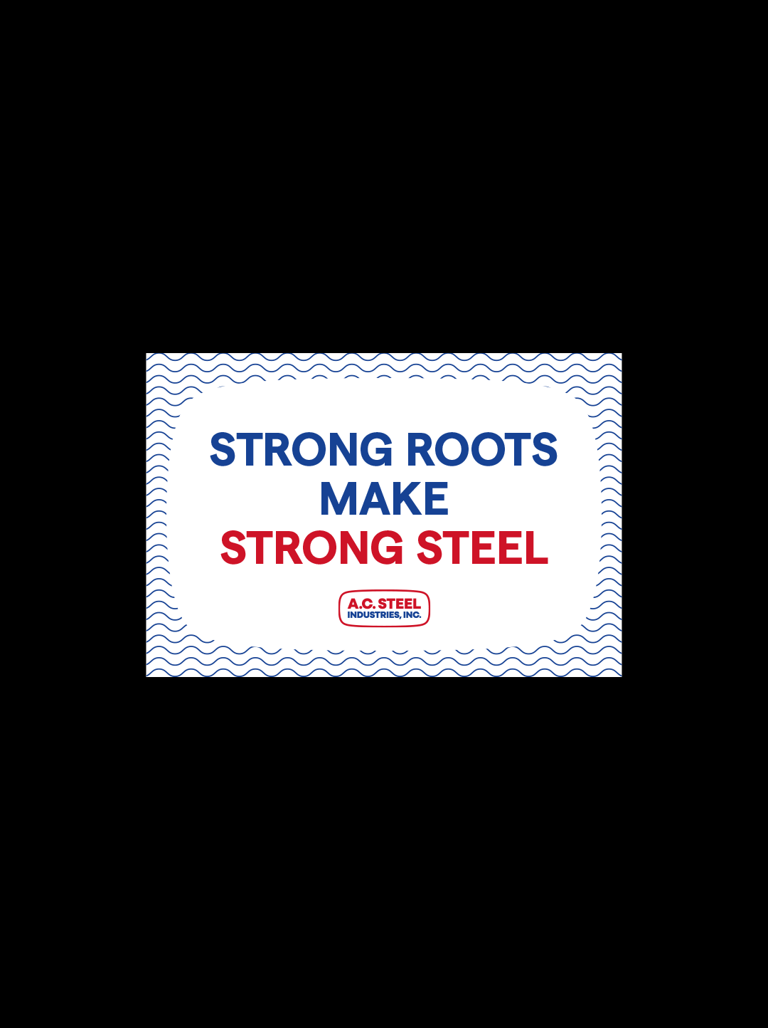
History in every sheet.
Empathy in every roof.
Strength in every person.
The brand needed to communicate durability, but also humanity.
VISUAL IDENTITY REDESIGN+ BRAND STRATEGY
The Strategy
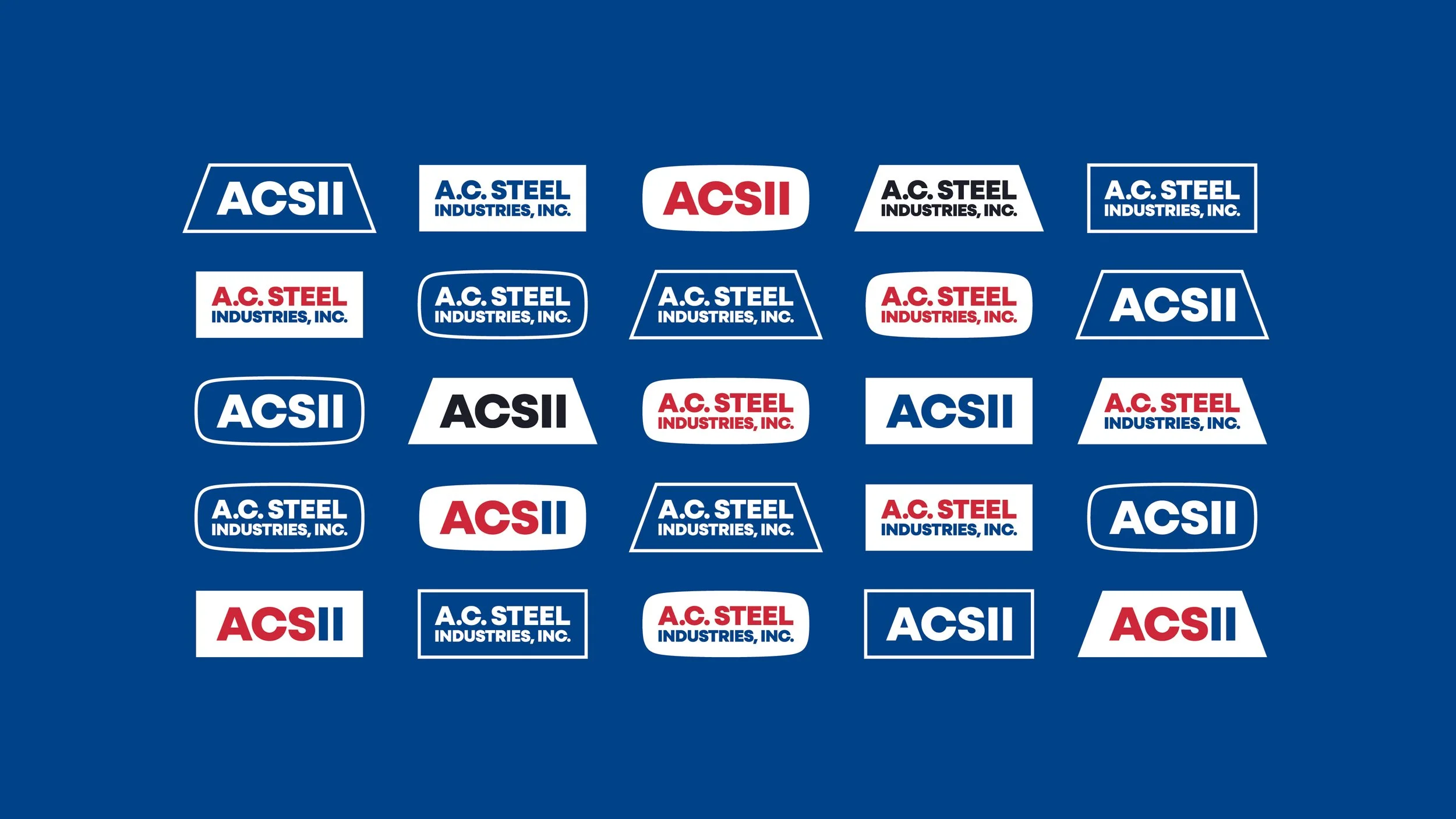
We approached the project through preservation + progression:
Respect the visual memory.
The oval frame and red/blue color system were recognizable brand assets that had to remain.
Strengthen authority.
The typography was refined to feel bolder, more industrial, and more confident.
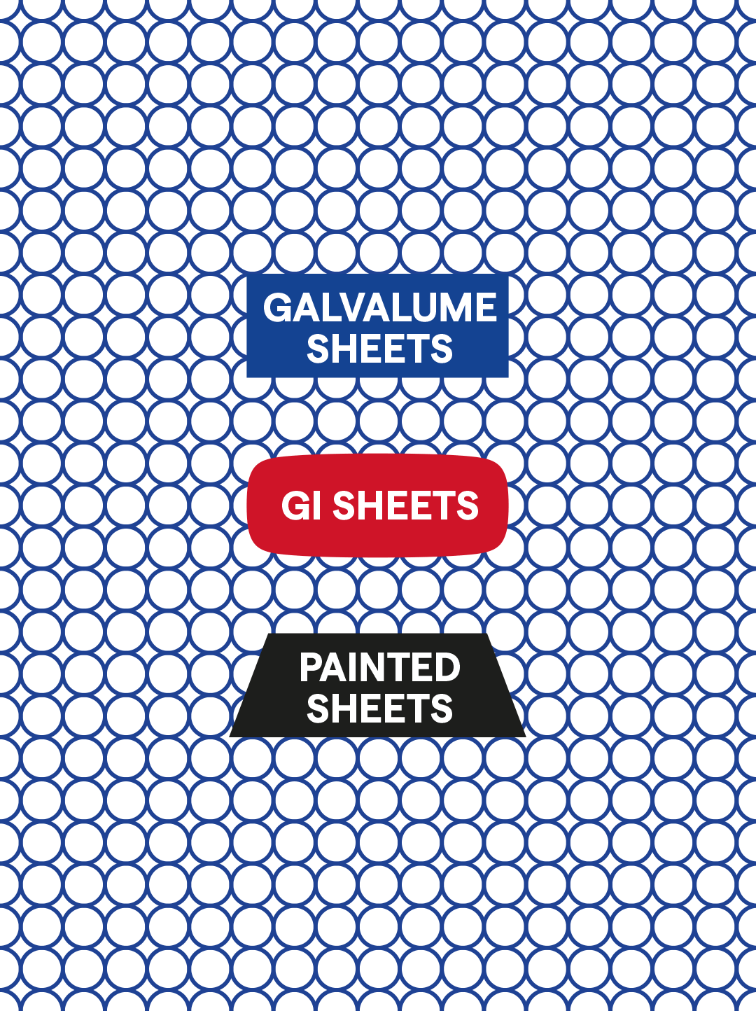
Simplify for scalability.
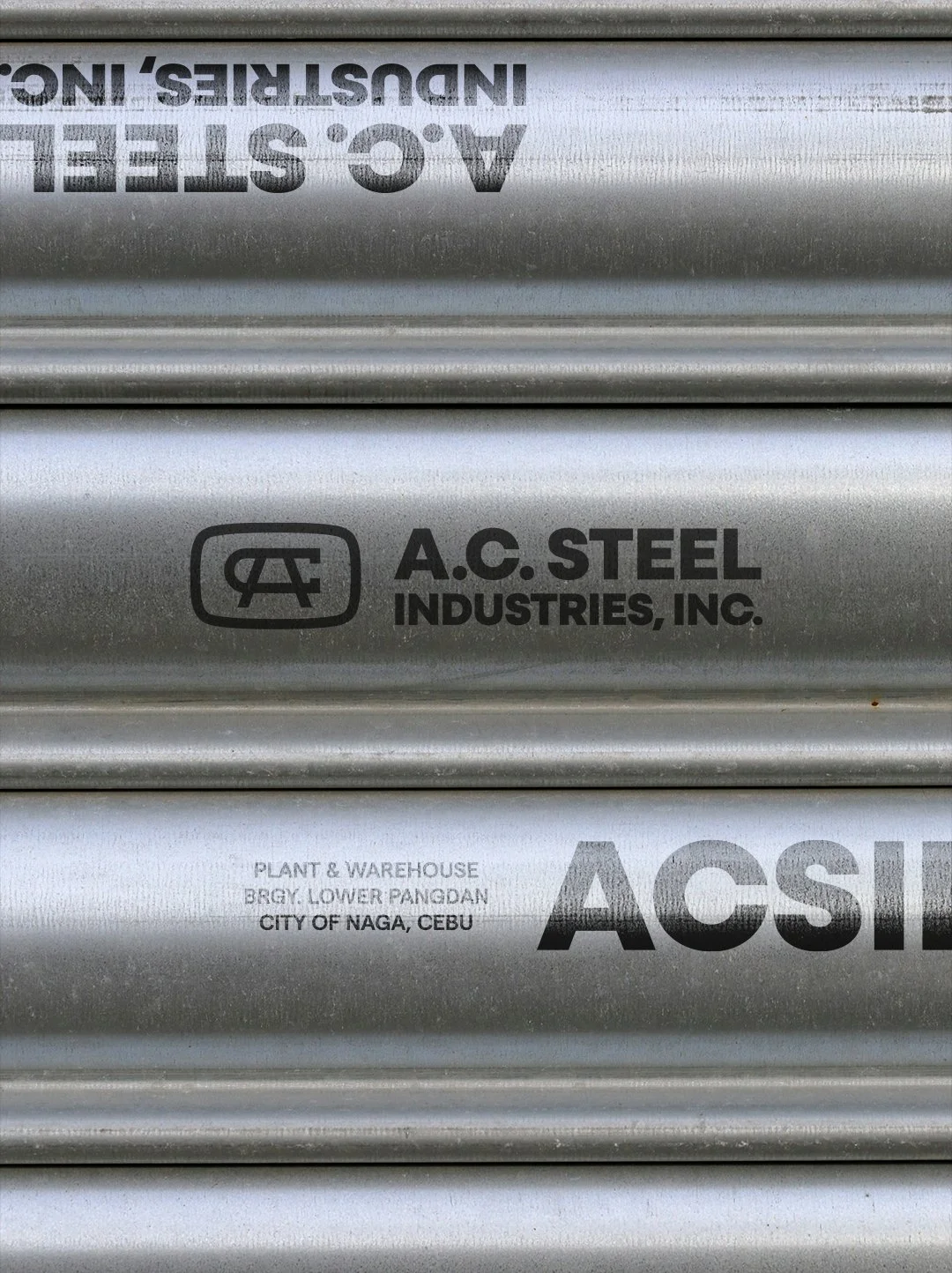
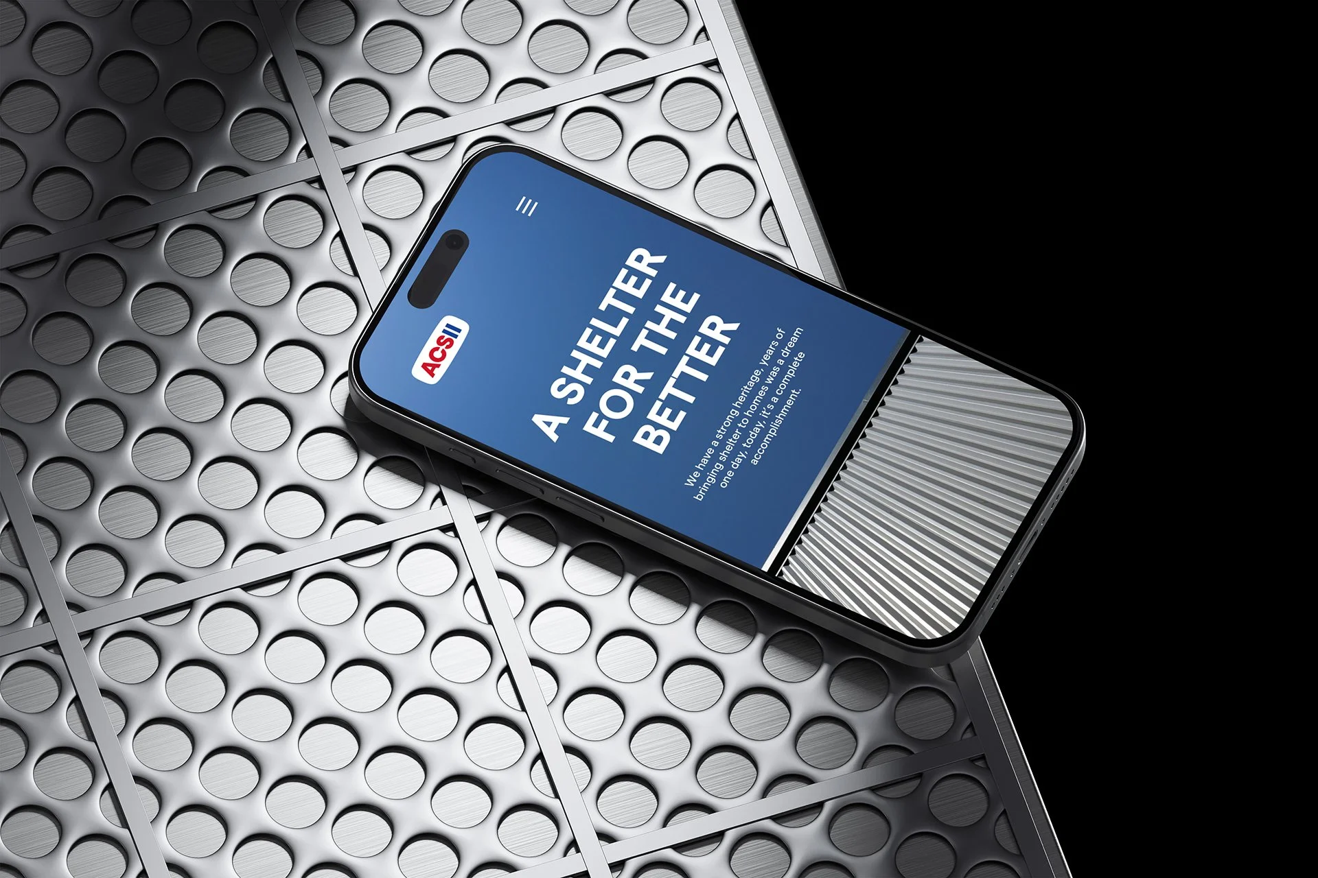
The new identity needed to function across trucks, packaging, uniforms, factory signage, and digital platforms.
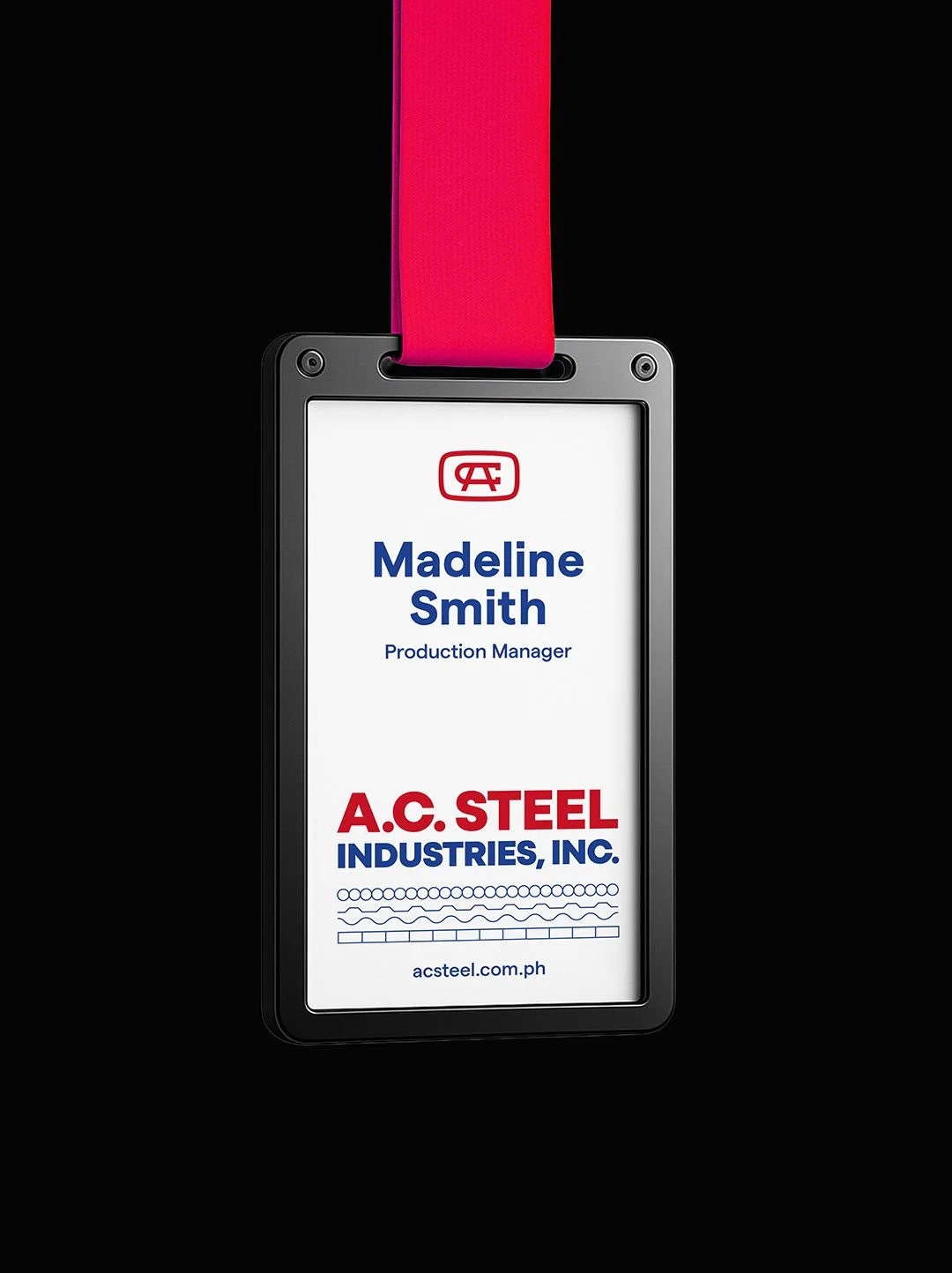
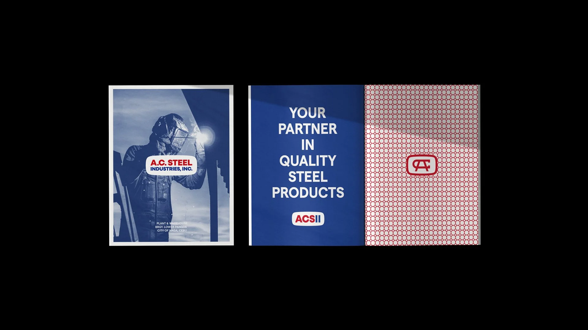
Create a brand stamp.
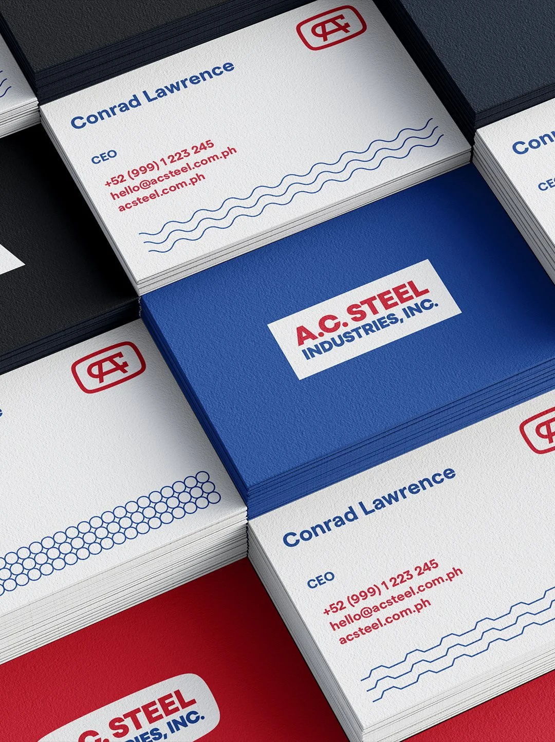
We developed a secondary icon — a distilled symbol designed to operate as a seal of quality and commitment.
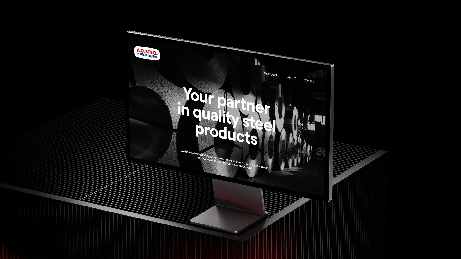
The Solution
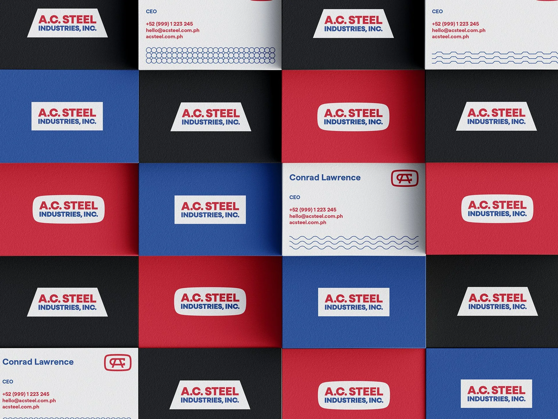
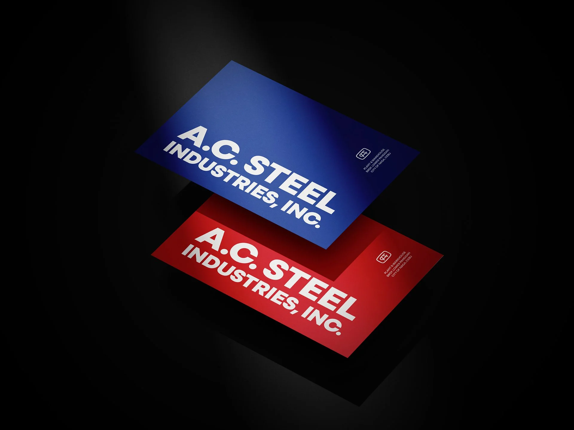
The new AC Steel identity retains the bold red and blue palette — reinforcing strength, reliability, and national pride — while introducing a more contemporary and assertive structure.
The softened rectangular frame modernizes the legacy oval without abandoning it. The updated typography communicates stability and forward momentum. The system feels industrial, confident, and unmistakable.
The brand icon serves as a recognizable stamp — a visual shorthand for quality and trust — adaptable across physical and digital applications.
The result is an identity that feels both established and future-ready.
The Outcome
AC Steel now carries a brand that:
Honors decades of heritage
Commands a stronger shelf and street presence
Scales confidently across industrial and digital touchpoints
Aligns emotionally with its core promise: protection, strength, and commitment
This was not about changing who they are.
It was about making sure their identity reflects the strength they’ve always had.


NEXT PROJECTS

PINGÜINO

9 HERMANOS
LEAVESAFE